 Maddie has a distinct style --- strong, purposeful lines and bold colour. Presented with some gravel and sea shells, she immediately created a still life arrangement and got down to painting, never stopping until she was finished. Notice how she portrays gravel --- tiny spots of colour densely clustered in the center around the shells, becoming gradually larger and farther apart toward the edges of her paper.
Monday 16 May 2011
Stones and Shells - still life by Maddie
Maddie has a distinct style --- strong, purposeful lines and bold colour. Presented with some gravel and sea shells, she immediately created a still life arrangement and got down to painting, never stopping until she was finished. Notice how she portrays gravel --- tiny spots of colour densely clustered in the center around the shells, becoming gradually larger and farther apart toward the edges of her paper.Sunday 15 May 2011
Mini Daffodils -still life by Niah (grade 6)
 Niah has remarkable "colour sense"! Look at the way she places her bright yellow blooms against a vivid blue background, drawing immediate attention to her focal point. She doesn't stop there either --- note the wrapping on the flower pot --- First she applies bright red to the top of the wrapping, then she repeats the same colour on the table below, pulling the viewer's eye down and around her painting. I also really like the shadow above and below the ribbon. Nice work!
Sea Shells and Water - Still life - Mixed media - by Taylor (grade 6)
 Taylor arranged this little scene of sand, gravel and sea shells on her drawing board, and then, viewing it through a picture frame, began to draw. Done in pastel and watercolour, I particularly like the way she conveys a sense of water shifting over and and around the shells, as though the viewer is right there with toes in the sand, looking down. Holiday anyone?
 Saturday 14 May 2011
Strawberries - Still life by Ria
 As this little piece demonstrates, a good painting does not require exotic subject matter; some of the best art centers on everyday subjects. At first glance, a plastic box of strawberries on a white plastic table may seem rather uninspiring. However, by angling the box so that it lies diagonal to her frame, and paying attention to the contours of clear plastic against the white background, Ria turns a seemingly mundane subject into an interesting study. And just look at those berries! Doesn't this picture make you want to go out and buy a box?
Onions, garlic & fruit - still life by Ria (Cropped Version)
 Would you believe that at one point Ria considered this beautiful little painting a failure? While adding her finishing touches, she inadvertently applied a colour she didn't want just under the bowl. The more she tried to adjust it, the muddier it became, until she finally declared the whole thing a loss and cast it aside. Months later, she rediscovered it and we looked at it again together. The first thing that that hit me was how effectively she conveys texture in this picture --- her fruit appears positively succulent, the onions smooth and tender, the garlic, crisp and papery. The areas in light are well modelled and thrown into relief by the areas in shadow. And the colours are clear and transparent --- except, Ria lamented, for that muddy area below the bowl. And that area, she felt, basically ruined the picture. Well, I said, why don't you crop it? You could cut off the bottom of the page, removing the base of the bowl along with the offending smudge below. If you do this, you might want to balance it by cropping the right side of the paper as well. The result will be a closer view of the subject (see the picture above) but as a composition, I think it works very well. Have a look and tell us, what do you think?
Plush Turtle - Still life by Tess (grade 4)
 When I mentioned to students that I would like them to create a still life arrangement of their own, Tess knew exactly what she wanted to do. As luck would have it, she had brought a beautiful plush turtle to school that day; after placing a sea shell beside it, she was soon busily drawing. Notice how effectively she captured the plush texture of her subject! When I asked Tess what she planned to do for her background, she told me the turtle would be pictured swimming free in the ocean --- hence the watery blue environment. There is a real feeling of happiness in this picture.
Sea Shells and Gravel by Niah (grade 6)
 Niah also created a still life arrangement this week out of sea shells and gravel and then drew it looking through a picture frame. I love her treatment of the stones, rendered in pale yellows, golds, browns and blacks. Niah has a wonderful sense of colour, and decided take a little artistic licence with the colour of her shells, which in reality were rather bleached and faded. Accordingly, she painted the one on the right, a bright blue, and made several others a pale pink --- definitely an improvement!
 Still life arrangement - work in progress - Chloe (grade4)
 Chloe created her still life out of a number of items around her --- an apple, a ruler, a stapler and eraser. I particularly like her treatment of the apple, which she rendered in a loose impressionistic style --- that is, until hunger overcame her and she ate it up! No matter, we'll bring another apple next session! The addition of a backgroundwill unify the various elements of this picture, bringing the whole thing together. Nice work Chloe!
Birds - Watercolours by Ria
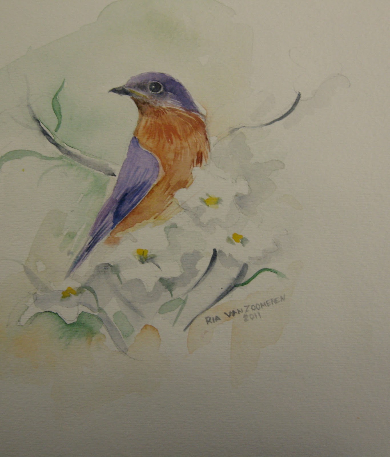 Ria's bird studies, taken from magazine photos (Birds and Blooms) and cropped to her liking, reveal a keen awareness of proportion and anatomical detail. Yet, for all her attention to detail, these compostions avoid the common pitfall of appearing overworked or "busy". Notice how she keeps her colours clear and her backgrounds relatively simple and unified --- not an easy fete! There is a lovely airiness to these little pictures; I'm not sure which one I like best --- I wonder, what do you think?


Squirrel - Acryilic painting in progress - by Katherine (grade 9)
 Some people love the lightness and transparency of watercolour, others prefer the heavier, opaque qualities of acrylic and oil. It's all a matter of personal taste, and Katherine, leaning toward the latter group, has decided to paint her squirrel with acrylics. She's made a great start here, blocking in her background with solid colour and moving carefully around the edges of her center of interest, bringing it into focus even before it is painted. Even at this early stage, there's a nice feeling of unity to this picture. Looks promising!
 Katherine (grade 9) "Drawing and Quartering"
 Here we see Katherine using a photo from a wildlife magazine as she sketches a squirrel. To aid the process, she has placed a transparent sheet of plastic over her image and drawn horizontal and vertical lines on it, dividing the image into quarters. She has likewise divided her drawing paper with light pencil lines. Quartering an image this way can make it easier to determine the position, size and relationships between various elements in the picture. As Katherine is already proficient at drawing, I am certain she would have produced a very good rendition of a squirrel with or without this exercise. However, she claims it made the process easier and faster, and within a short time she had a remarkably accurate sketch, ready to paint!
 Cardinal -Watercolour by Clara (grade 2)
 Clara drew her cardinal using a reference photo, and it's clear she has a very good eye for proportion and detail. She also has a real feel for watercolour --- note the exceptional delicacy of her background wash and blossoms, not to mention the little red bird! Lovely work, Clara!
 Maddie - (grade 2) two paintings
 Maddie doesn't fool around ---Give her some space and a few art supplies, and she gets right down to business! Here, you can see she's been drawing as well as experimenting with washes of colour. I find the composition on the left particularly interesting from a creative standpoint: Using a reference picture, Maddie began by drawing a rot iron fence in the foreground. She then disgarded her reference photo and began working purely from her imagination, creating a complex background of buildings and sky! Great work!
Cat by Tess (grade 4)
 Tess has a great sense of colour and design, as illustrated by this striking composition in bright orange, blue and black (yes, black can be bright!) I love the big, bold shapes that go past the edges of her paper --- very nice work, Tess!


Julia's butterfly, ready to paint
 Julia took her time carefully drawing this butterfly using a photo from a wildlife calendar.
Sunday 8 May 2011
Penguins - work in progress by Katherine

When her background was dry, she dampened the ice berg, and applied a touch of yellow and blue to capture the faint greenish tint of the ice. Now only the penguins await her finishing touch --- they'll get their little black jackets next time!. Looks promising, Katherine!

Still life studies in water colour - by Julia

Flowers and Butterfly - by Leah (grade 5)

Bison at Sunset by Chloe (grade 4)

Seals on ice - by Chloe (grade 4)

Arabian horse - pastel - by Guin (grade 5)
 Would anyone guess that Guin knows and loves horses? Having meticulously worked out her plan (see previous post), she finishes up with colour. This is a very nice portrait on several levels --- note how her composition comprises 3 main shapes --- the light, positive shape of the horse's head and neck in the middle, the darker green shape of the stable door to the left and bottom, and the black negative space to the top and right. There's a unity to these shapes, like the pieces of a puzzle. As well, she uses subtle colour on the white horse to convey the surface contours on its head and neck. She also captures the lovely soft expression of the animal's eye.
Horse - work in progress by Guin

Blue Jay in pastel - by Taylor (grade 6)


Elephants by Niah (grade 5)
 Niah's first picture in pastel shows her good eye for proportion and a real flair for colour! In her original reference photo, two grey elephants stood against a background of faded greys, ochers and browns. Such lack of contrast and colour can add up to a rather dull painting. In response to this problem, Niah positioned some dark vegetation next to the light coloured animals. She then filled her background with a combination of warm yellow and orange, which contrasts nicely with the pale tones of the elephants, and captures the feeling of intense sunlight and heat. Nice use of cool tones in the shadow areas too!
 Saturday 7 May 2011
Chloe`s Muskrat

Martin - Pastel by Tess (grade 4)

Maddie's Peacock

Julia's two birds --- Painted!
 Having completed her drawing, Julia is ready to paint. She begins by wetting her background with water and adding a wash of blue. She then gives the two birds a wash of yellow and adds a touch of colour to the eyes. She says the black details around the eyes and beak will be next. Nice work, Julia!

Thursday 5 May 2011
Two birds by Julia
A wildlife calendar provided the inspiration for Julia's bird drawings. Birds are complex creatures to draw, so in order to simplify the task, we taped her chosen photo onto a drawing board beside a piece of drawing paper. Then we drew a same size frame on the drawing paper. Next, we took a large sheet of paper and placed it over the bottom 3/4 of the photo and the drawing paper, so that only the upward pointing beak of the one bird was visable. This gave Julia an isolated view of the beak, a relatively simple shape. Holding the "cover paper" in place, she began drawing that shape, taking into account where it was situated on the page, it's length, width, angle, etc. When finished, she moved the cover sheet down, exposing the head and part of the neck below. She proceeded to draw that section, continuing gradually down the page, completing section by section, until both birds were completed. As a beginner, she found the exercise challenging, but I think you'll agree, she did a great job!

Subscribe to:
Posts (Atom)